Showing posts with label Brief 04 — Svpply. Show all posts

OUGD603: Brief 04 — Svpply - Final Boards / Evaluation

Below is an ISSUU document containing my final boards for Svpply: 


Evaluation


A really challenging brief for me.  Little did I know it, but I actually have a lot less experience designing for web than I first thought. I have designed plenty of websites before as part of branding projects, but this was the second time I’ve designed a website in the correct way for it to be coded, in terms of folders and organisation.

Secondly, Svpply combines two of the most complicated types of websites: Ecommerce & Social Media. This means that an endless amount of pages could be create, so it was essential to decide on which main pages would be designed and stick to the plan.

Originally, the plan was to create a website on Adobe Muse, which codes the website itself as you design. After experimenting with the software, I asked a friend, a web designer, if Adobe Muse is actually used in industry. I was informed that it codes websites really badly, and it yet to be put into full swing. It was great to try out the new software, but something I will put on hold until it’s in use.

When using Adobe Muse, I planned to design as I go a long, which obviously ended up not working out in my favour. When I went back to designing the website in Adobe Photoshop, I approached the project with a dramatic difference, the way a web designer would: using sketches and rough wireframes. Since the website was so complex, this helped split the project up more into the pages I wanted to develop.


I intend on taking this approach in the future, as I feel the overall outcome for something so complex is visually simple, interactive and functional.

Thursday, 21 May 2015 by Unknown
Categories: , | Leave a comment

OUGD603: Brief 04 — Svpply - Wireframe Into Final Designs

Now the wireframes have been designed, the next step was turning them into actual designs. Images and information were taken from websites that would be included on Svpply, such as: Mr Porter, ASOS, GoodHood, Cncpts, Urban Outfitters, Etsy & Topshop. 

Home Page: 


The same colours are used for different sections as on the originally Svpply website, to colour code each section: 


An example of the subcategory page - You can also see how i've kept all the folders organised in a way that would be suitable for coding. 


A 12 column grid was used to keep the pages constant and well structured: 


Before adding the content images and text, you can see that text was copied and pasted, with rectangles used for images: 


Images were placed inside clipping masks to fit into the grid: 


Slowly adding images: 


The finalised page:


Dropdown menus were added as separate layers, so they could be turned on and off: 


How the 'store' profile is being filled in: 


The mobile pages were also designed with boxes left for content: 


With the added content: 


As you can see on the original design below, the same dropdown menu has been used on the mobile device: 


The added dropdown menu: 


Icons were downloaded from a free source and added: 


The closeup product page on mobile: 


The 'wants' and 'collections' options that were first experimented with. These work well on the below image since it's originally dark, but would not work well on light images. 


For this reason, it was changed to a solid colour. The colour is based on the subcategory. 


So each subcategory has it's colour when selected: 


Tuesday, 5 May 2015 by Unknown
Categories: , | Leave a comment

OUGD603: Brief 04 — Svpply - Creating Wireframes


After realising the difficulty of Adobe Muse, and after speaking to a coder, it seems the best way of developing the website is using Adobe Photoshop, for a coder to code. Obviously before going straight into Photoshop, it was essential to create wireframes: 

Home: Users get a sample of what's on the site, as seen in the boxes. There will also be a new arrivals section and a sign up section. The top bar has the 6 options for different types of items available on Svpply. Next to them is a profile button, as well as a feed and search button. 


Under New Arrivals: The list of options for each subcategory, in a 5 column grid. I intend on changing this to a four column grid, 5 looks too busy. 


Within each of the pages above, there are individual searches, as seen below. These will follow the same grid system, but with more specific searches, like 'brand', 'size', 'price' and 'colour': 


Below are the 'profile' and 'collections' pages. Each user will have their own profile, which shows the items they want, own and 'collections'. Collections are basically groups of products saved under the same section, e.g. 'Favourite winter clothes' or 'Decor ideas':


Each specific item will have their own more detail page, as seen in the 'details' page below. On the right is the 'feed' where you can see updates from other people you follow, as well as shops you follow:


Below are some ideas on the mobile / tablet version. Both will use a single column grid, as displayed with the homepage and details on an item below. The same drop down menu will be used as originally seen on Svpply: 


Thursday, 2 April 2015 by Unknown
Categories: , | Leave a comment

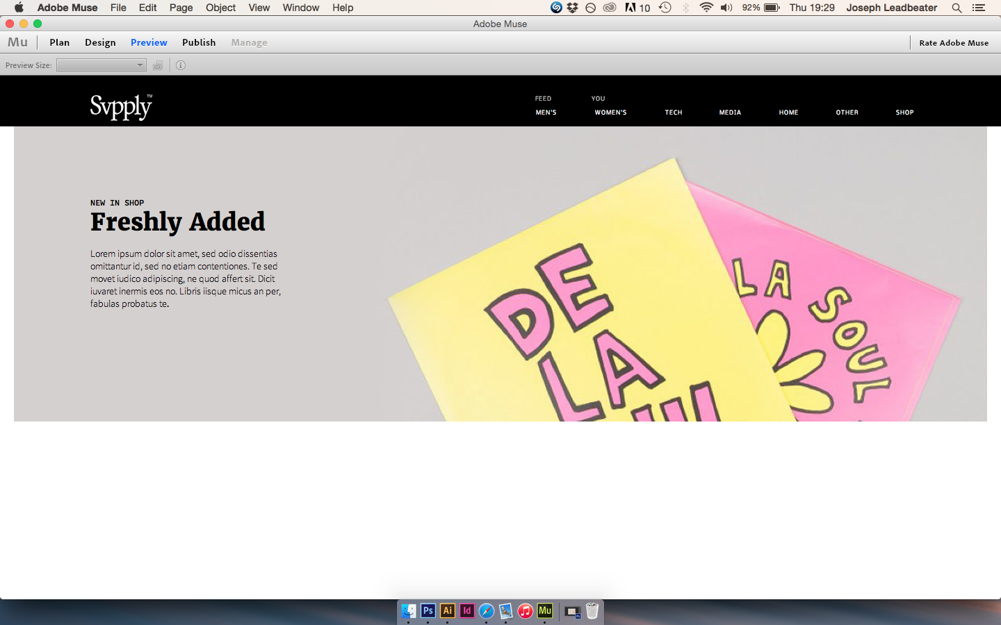
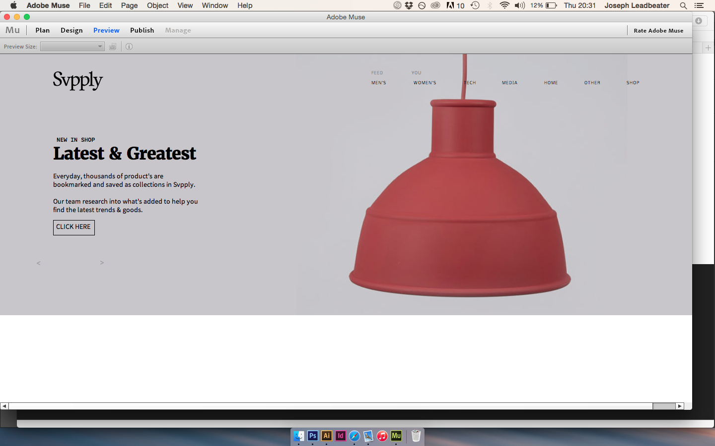
OUGD603: Brief 04 — Svpply - Developing The Website In Adobe Muse ANNOTATE AND DO MORE

Here I will show the progression of the website using the software Adobe Muse. After realising such a HUGELY complex navigation is needed for such a complicated website, I intend on only developing a few pages. The aim of this project is to learn the basics of new software through application, so I aim to challenge myself whenever possible.


Sunday, 22 March 2015 by Unknown
Categories: , | Leave a comment

OUGD603: Brief 04 — Svpply - Research Into Websites

Although many of the website's below use different navigation, I wanted to look into web designer aesthetic and navigational features that could be of use. 

https://www.behance.net/gallery/4853285/Olav-Weiken


The image grid below works really well. This may be down to consistent imagery, but also the use of a simple grid.,


Full bleed imagery works well when an image with a basic background is in use. 


The web version uses a single column grid, maximising image space. 


https://www.behance.net/gallery/18680945/Headphones-store


Images have been used well in the above example. Once again, the use of a simple grid gives the website a clean aesthetic, emphasised by the use of a light font. 


https://www.behance.net/gallery/18011447/HAY


Above you can see the use of a 15 column grid, giving the pages consistancy, but also flexibility and variation. Images appear scattered but also organised. 


https://www.behance.net/gallery/12253837/Modernist


The use of simple and bold colours works well to separate the website above. 


http://www.wearesabbath.com


A refined colour palette makes the above example stand out well. The boxed navigation allows flexibility as well as constancy with each page. The navigation is also something unique that i've never seen before. 


Thursday, 26 February 2015 by Unknown
Categories: , | Leave a comment