Continuation of the digitalisation of characters.
Before tracing the characters, its best to ensure all the characters are straight, this can be seen below:
The full character set:
Another set of letters:
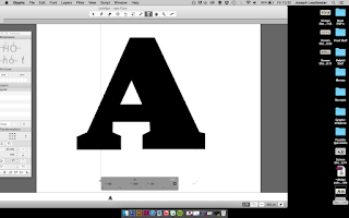
The uppercase A before the serifs are curved:
A strange set of characters below, with interesting uppercase proportions:
Another example:
Although not part of the same typeface, the italic characters were digitalised to show in context with the other characters:
A comparison of the original and the revival:
Although the following characters are lettering instead of a typeface, digitalising them gives more variation to letters that have been digitalise so far.
A chunky slab serif being digitalised:
The original example and the revived letters:
A tall, low contrast sans serif being digitalised:


